Fonts in need of a good revival
These fonts all suffer terribly in their current digitizations. Mostly they are lacking energy or just plain ugly compared to the beauty found in their original metal forms; or, they’re acceptable fonts which just fail to capture the spirit of the originals. Some of these are some of the greatest typeface designs in the world, with some of the ugliest digital fonts in the world as their only present legacy.
- Joanna, by Eric Gill
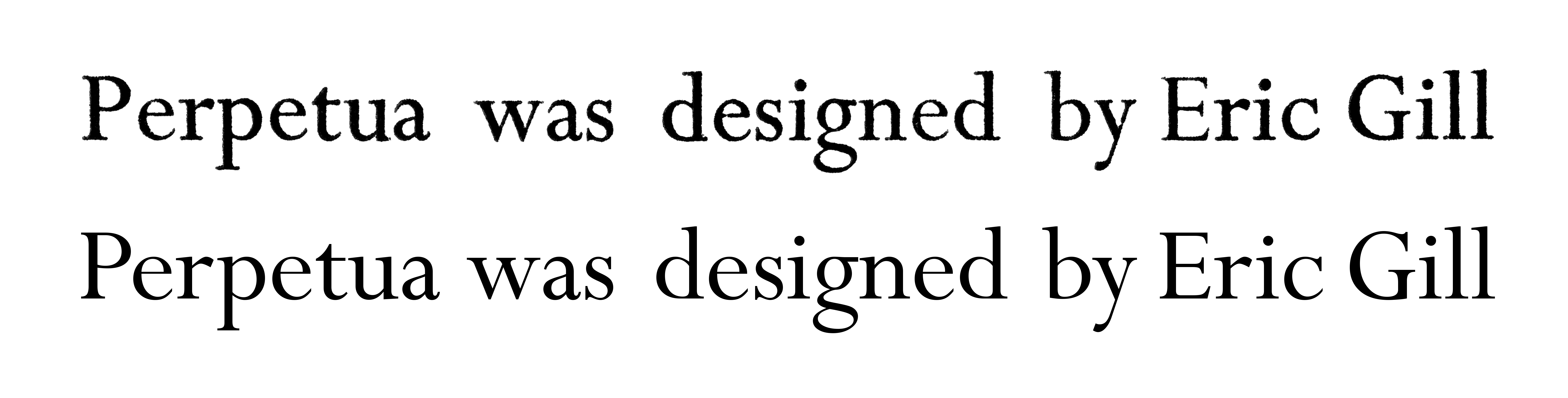
- Perpetua, by Eric Gill
- Golden Cockerel, by Eric Gill
- Times New Roman, by Stanley Morison
- Bembo, by Stanley Morison — if only Edward Tufte’s personal revival, ET Bembo, were publically available … (actually, Bembo Book doesn’t look too bad!)
- Centaur, by Bruce Rogers
- Bodoni — good starting point is Morris Fuller Benton’s ATF revival
- Palatino / Aldus, by Hermann Zapf
- Walbaum, by Justus Walbaum
- The Fell Types
Many of these font designs are now in the public domain. It would be nice to see revivals of these as open-source or otherwise freeware fonts, so they can be used freely on the Web; but commercial revivals would do just as well.
Suggestions and rôle models
- For Bodoni and Walbaum, H&FJ Didot is a good reference for how to pull off optical scaling for modern serifs; look at Computer Modern also for an example of how hairlines carry well from small sizes to large. (The latter is a rare beast: a modern font perfect for text which fails to impress at larger sizes.)
- For many of these fonts, the problem is what Dean Allen once called a “common mistake” of the digitizers using shapes “based on the most basic starting point of […] designs. These designs were intended for metal type that would press into paper, the ink spreading as it absorbed into the fibre. The resulting printed shapes had a good deal more visual force than the original designs. The process was total: design anticipating application” and the resulting digital face “suffers from the perfection of the process of digital design and offset printing: the original shape is printed coldly intact”. This is certainly true of Joanna, Perpetua, and Bembo, for instance, and as Dean says, of Centaur too. Wikipedia hosts an example showing the difference in Perpetua.
- Others, such as Times, simply suffer from a lack of sensitivity for the delicate aspects of the shapes of the letters. Times’s reputation for boringness stems at once both from its default status in word-processing packages, and from the utter lack of interest in the letterforms of the digital revival.
- The Fell Types are an unusual case: the existing revivals (1, 2) take the idiosyncracies of the metal type’s application to paper rather too far, making digital versions which are deliberately overly lumpy in an attempt to create a historical feel. What were once extremely usable text types become parodies, useful only for display in mock-historical documents.
Request to all typeface designers
Please include IPA symbols — at least for the most commonly used ones in transcribing English words. (Many of these are just turned versions of other letters, like turned v and schwa, but there are some like eng, esh and ezh that need designing specially.)